
Book covers have come a long way from their humble beginnings. In the earliest days of printing, books were precious objects, often bound in plain leather or cloth. Their value lay in the words inside, and covers were designed to protect rather than attract. Titles, if they appeared at all, were handwritten or stamped in small type, with little thought for decoration.
By the 19th century, advances in printing technology transformed book production. Publishers began to realise that the cover could be more than just a protective shell—it could be an advertisement. Decorative cloth bindings with embossed titles and gold leaf became popular, turning books into attractive household objects as well as vessels of knowledge.
The 20th century marked a revolution in book cover design. The rise of the paperback in the 1930s and 1940s opened up affordable reading for the masses, and covers became colourful, bold, and designed to leap off crowded shelves. Crime, science fiction, and romance novels often featured striking illustrations or dramatic typefaces, promising excitement within. The cover was no longer just packaging; it was a marketing tool.
By the late 20th and early 21st centuries, graphic design and digital tools pushed cover art into new territory. Minimalist typography, photographic imagery, and symbolic motifs reflected changing tastes. Covers evolved to signal genre instantly: moody landscapes for crime, whimsical art for humour, and abstract designs for literary fiction. With the advent of ebooks and online retail, another shift occurred—covers had to work as tiny thumbnails on a screen, catching the eye in seconds. Bold titles, clean designs, and vibrant colours became essential.
Today, a book cover is often a collaboration between authors, publishers, and designers, balancing art and marketing. A great cover doesn’t just wrap a book—it tells a story before a reader even turns the first page.
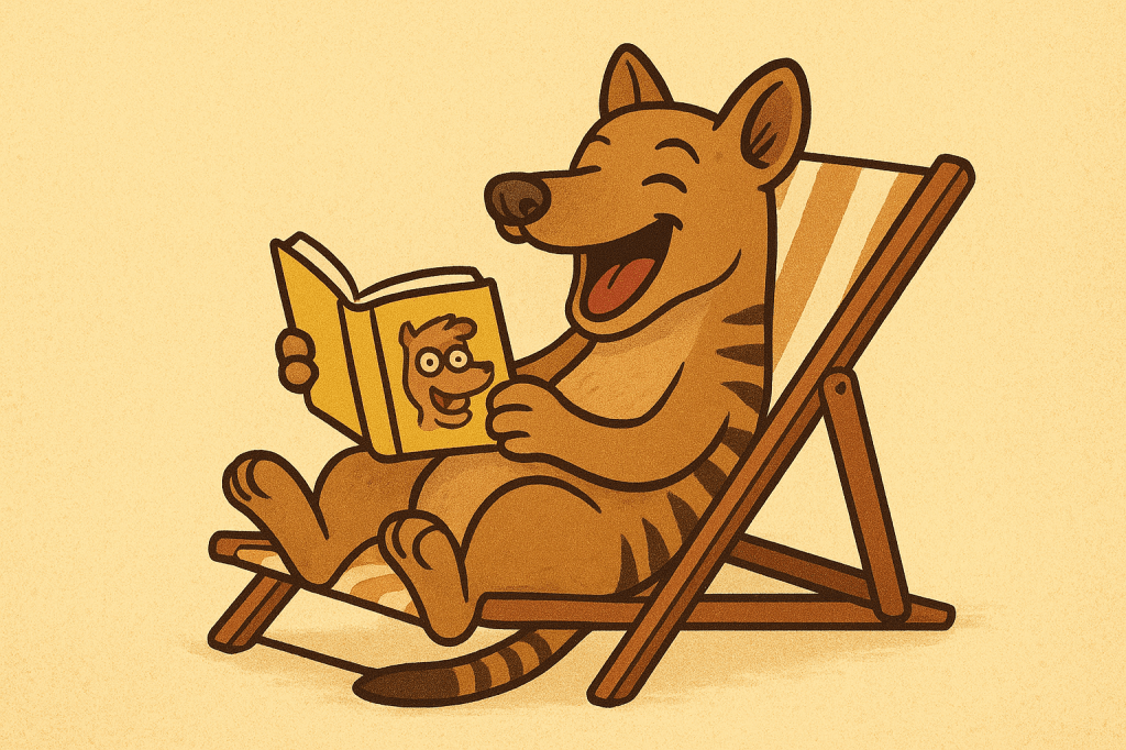
In my own journey, I’ve recently enlisted the help of ChatGPT to refresh the covers of my Windy Mountain series. Each features a Tasmanian Tiger—better known as the Thylacine—appearing in different guises. Over the course of the series, my tiger has shown up as a Shakespearean actor, Elvis Presley and even a lifeguard. These playful covers reflect the quirky, humorous spirit of the stories inside, and remind me that the evolution of book design is ongoing—always changing, always creative, and always inviting readers to take a closer look.


Leave a comment